In today’s data-driven business landscape, the ability to compare modeled predictions with actual outcomes has become essential for organizations seeking competitive advantages and operational excellence.
🎯 The Foundation of Performance Intelligence
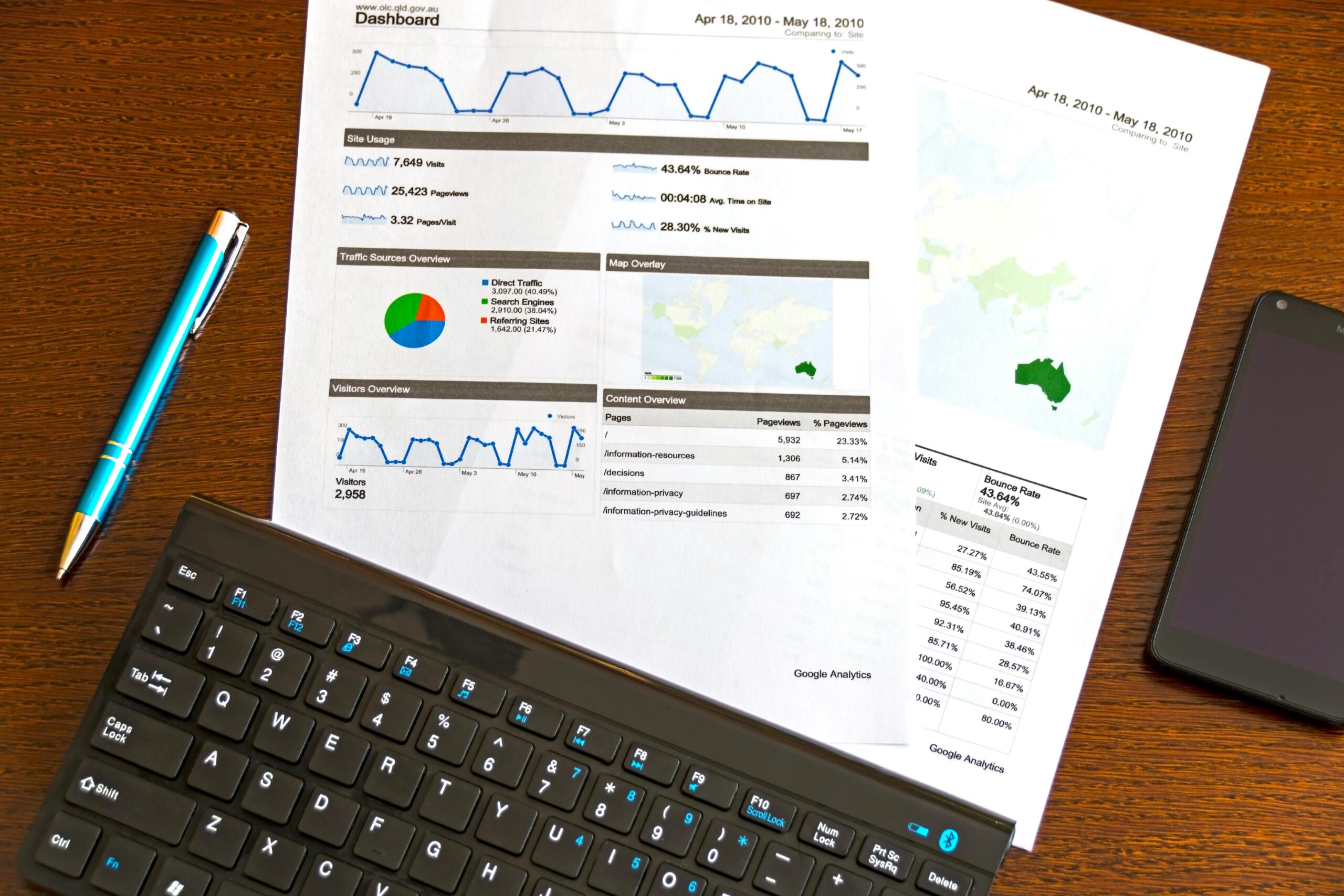
Performance monitoring has evolved dramatically from static spreadsheets to dynamic, real-time visualization platforms. Dashboards serve as the critical interface between raw data and actionable insights, enabling decision-makers to quickly identify discrepancies between forecasted models and real-world results. This capability transforms how organizations respond to market changes, operational inefficiencies, and strategic opportunities.
The concept of modeled versus actual performance centers on the fundamental business need to validate assumptions. Every strategic plan, budget forecast, or operational prediction creates a model of expected outcomes. Without systematic monitoring, organizations operate blindly, unable to detect when reality diverges from expectations until significant damage has occurred.
Modern dashboards bridge this gap by providing visual, intuitive representations of variance analysis. They transform complex datasets into comprehensible formats that highlight where actual performance exceeds, meets, or falls short of modeled expectations. This visibility enables proactive management rather than reactive crisis response.
Building Blocks of Effective Performance Dashboards
Creating dashboards that genuinely enhance monitoring capabilities requires understanding several foundational elements. The most effective solutions balance comprehensiveness with simplicity, providing depth without overwhelming users with excessive information.
Data Integration and Real-Time Connectivity
The power of any dashboard depends entirely on the quality and timeliness of its underlying data. Organizations must establish robust data pipelines that connect modeling systems with actual performance databases. This integration ensures that comparisons reflect current reality rather than outdated snapshots.
Real-time connectivity transforms dashboards from historical reporting tools into living intelligence platforms. When actual sales, production outputs, or operational metrics update continuously, managers can detect deviations immediately. This immediacy compresses response times from days or weeks to hours or minutes, dramatically reducing the cost of variance.
Data normalization presents another critical consideration. Modeled predictions and actual results often originate from different systems with varying formats, granularities, and definitions. Effective dashboards reconcile these differences, ensuring true apples-to-apples comparisons that support valid conclusions.
Visualization Principles That Drive Understanding
The visual design of performance dashboards significantly impacts their utility. Well-designed visualizations communicate complex relationships instantly, while poor designs obscure patterns and waste cognitive resources.
Color coding serves as one of the most powerful visual tools for variance analysis. Standard conventions—green for favorable variances, red for unfavorable, and yellow for borderline situations—enable rapid pattern recognition. Consistent application of these standards across all dashboard elements creates intuitive navigation.
Chart selection matters enormously. Line graphs excel at showing trends over time, making them ideal for tracking how actual performance diverges from or converges with modeled predictions. Bar charts effectively compare discrete categories, useful for analyzing performance across products, regions, or departments. Gauge charts provide instant status indicators for key performance metrics.
🔍 Strategic Variance Analysis Through Dashboard Intelligence
Beyond simply displaying differences between modeled and actual performance, sophisticated dashboards enable deeper analytical capabilities that uncover root causes and support strategic decision-making.
Dimensional Drill-Down Capabilities
High-level variance summaries provide initial alerts, but understanding requires depth. Effective dashboards support multi-dimensional analysis, allowing users to drill down from aggregate numbers to increasingly granular detail. A revenue variance might initially appear as a single percentage, but drilling reveals which products, regions, or customer segments drive the difference.
This capability transforms variance detection into variance understanding. Rather than simply knowing that actual sales fell 15% below forecast, managers discover that one product line underperformed by 40% while others exceeded expectations. This granularity directs corrective actions precisely where needed.
Time-Series Trend Analysis
Single-period variance snapshots provide limited insight. Performance monitoring gains power through time-series analysis that reveals patterns, seasonality, and trajectory changes. Dashboards should display both current variances and historical trends, enabling users to distinguish between temporary fluctuations and sustained deviations.
Trend visualization helps organizations recognize when modeled assumptions require updating. If actual performance consistently exceeds or falls short of predictions across multiple periods, the underlying model needs recalibration. This feedback loop continuously improves forecasting accuracy.
Operational Applications Across Business Functions
Different organizational functions leverage performance dashboards in unique ways, each requiring tailored approaches to modeling and variance analysis.
Financial Performance and Budget Management
Finance departments pioneered systematic variance analysis, comparing actual revenues, expenses, and profitability against budgets and forecasts. Modern dashboards elevate this practice through automation and enhanced visualization.
Financial dashboards typically organize around income statement line items, displaying both absolute variances and percentage deviations. Sophisticated implementations incorporate flexible budgeting, adjusting modeled expectations based on actual volume drivers. This capability distinguishes between true operational variances and simple volume effects.
Cash flow monitoring represents another critical financial application. Dashboards compare projected cash positions with actual balances, highlighting timing differences in receivables, payables, and financing activities. This visibility prevents liquidity crises and optimizes working capital management.
Sales and Revenue Intelligence
Sales organizations rely heavily on pipeline modeling and quota setting. Dashboards comparing modeled pipeline progression with actual advancement rates enable accurate revenue forecasting and early identification of at-risk deals.
Territory and representative performance monitoring benefits enormously from visual variance analysis. Managers quickly identify which salespeople exceed targets and which require additional support or coaching. Geographic heat maps reveal regional performance patterns that inform resource allocation.
Manufacturing and Operations Optimization
Production environments generate vast data streams suitable for real-time dashboard monitoring. Comparing modeled throughput, quality rates, and downtime against actual performance enables continuous improvement initiatives.
Operational dashboards often incorporate statistical process control principles, displaying not just variances but also control limits and capability indices. This combination distinguishes between normal process variation and significant deviations requiring intervention.
Supply chain visibility represents another valuable application. Dashboards comparing forecasted demand and lead times with actual consumption and delivery performance help organizations optimize inventory levels and prevent stockouts or excess.
📊 Technical Architecture for Scalable Dashboard Solutions
Implementing effective performance monitoring dashboards requires thoughtful technical decisions that balance functionality, performance, and maintainability.
Platform Selection Considerations
Organizations face numerous dashboard platform options, from specialized business intelligence tools to custom-developed solutions. The right choice depends on several factors including data volumes, user count, integration requirements, and analytical complexity.
Enterprise platforms like Tableau, Power BI, and Qlik offer robust visualization capabilities, extensive connectivity options, and scalability. These solutions excel when monitoring requirements span multiple departments and data sources. Their pre-built connectors simplify integration, while their advanced analytics support sophisticated modeling.
Specialized operational intelligence platforms focus on specific domains like manufacturing, logistics, or financial services. These solutions provide industry-specific metrics, benchmarks, and analytical frameworks that reduce implementation time and improve relevance.
Custom development using frameworks like D3.js, React with charting libraries, or Python-based tools offers maximum flexibility. This approach suits organizations with unique requirements or those seeking to embed analytics within existing applications.
Data Warehouse and Modeling Architecture
Effective variance monitoring requires a data architecture that cleanly separates modeled predictions from actual results while enabling efficient comparison. Dimensional modeling techniques organize data around business processes, creating fact tables for both forecasts and actuals with shared dimensional attributes.
This structure enables flexible slicing and dicing across time, product, geography, and other business dimensions. Query performance remains acceptable even as data volumes grow, since dimensional models optimize for analytical access patterns rather than transactional processing.
🚀 Advanced Analytics and Predictive Capabilities
Leading-edge dashboard implementations go beyond simple variance reporting to incorporate predictive analytics and prescriptive recommendations.
Automated Anomaly Detection
Rather than requiring users to manually scan for significant variances, intelligent dashboards employ statistical algorithms to automatically flag unusual patterns. Machine learning models establish baseline expectations and alert when actual performance falls outside predicted ranges.
This automation ensures that significant deviations receive immediate attention while filtering out noise from normal variation. Alert fatigue decreases as notifications become more relevant and actionable.
Scenario Planning and Simulation
Advanced dashboards enable interactive scenario modeling, allowing users to adjust assumptions and instantly visualize projected impacts. This capability transforms static variance reporting into dynamic planning tools.
Sales managers might model the revenue impact of different pricing strategies or promotional investments. Operations leaders can simulate the throughput effects of capacity additions or process improvements. These what-if analyses inform better strategic decisions.
Governance and Continuous Improvement
Sustainable dashboard programs require ongoing governance that ensures data quality, user adoption, and continuous enhancement.
Data Quality Management
Dashboard credibility depends entirely on data accuracy. Organizations must establish validation processes that verify both modeled predictions and actual results before publication. Automated reconciliation checks detect discrepancies between source systems and dashboard displays.
Clear data lineage documentation helps users understand metric definitions, calculation methods, and update frequencies. This transparency builds trust and prevents misinterpretation.
User Training and Adoption
Sophisticated dashboards deliver value only when users engage with them regularly. Comprehensive training programs teach not just technical navigation but also analytical thinking about variance interpretation and action planning.
Usage analytics track which dashboard features receive attention and which go ignored. This feedback informs iterative improvements that enhance relevance and usability.
💡 Measuring Dashboard ROI and Business Impact
Justifying continued investment in dashboard capabilities requires demonstrating tangible business value. Organizations should track specific outcomes attributable to improved variance monitoring.
Reduced time to detect significant variances represents one measurable benefit. Comparing how quickly issues surface with dashboards versus previous methods quantifies acceleration in response capability.
Improved forecast accuracy provides another valuable metric. As dashboards highlight consistent model biases, organizations refine their predictions, reducing planning errors and associated costs.
Decision quality improvements manifest in better resource allocation, more effective interventions, and enhanced strategic outcomes. While challenging to measure precisely, case studies documenting specific decisions influenced by dashboard insights build compelling value narratives.
Future Directions in Performance Intelligence
The evolution of dashboard technology continues accelerating, driven by advances in artificial intelligence, natural language processing, and embedded analytics.
Conversational interfaces will enable users to query dashboards using natural language rather than navigating pre-built visualizations. Simply asking “Why did West Coast sales underperform forecast last quarter?” will trigger automated analysis that surfaces contributing factors.
Prescriptive analytics will move beyond identifying variances to recommending specific actions. Dashboards will suggest optimal responses based on historical patterns, current conditions, and projected outcomes.
Embedded analytics will dissolve the distinction between dashboards and operational applications. Rather than switching to separate reporting tools, users will access performance intelligence within the systems they use for daily work, creating seamless analytical workflows.
🎓 Building Organizational Capability for Data-Driven Excellence
Technology alone cannot maximize dashboard value. Organizations must cultivate analytical cultures where data-driven decision-making becomes standard practice rather than exceptional behavior.
Leadership commitment proves essential. When executives regularly reference dashboard insights in communications and decision forums, they signal the importance of performance monitoring throughout the organization.
Cross-functional collaboration enhances variance interpretation. Finance, operations, sales, and other functions each bring unique perspectives to understanding performance gaps. Structured review processes that bring these viewpoints together produce richer insights than siloed analysis.
Continuous learning mindsets treat variances as opportunities rather than failures. When organizations respond to negative deviations with curiosity about root causes rather than blame assignment, they unlock improvement potential.
The journey toward maximizing efficiency through dashboard-enabled performance monitoring represents ongoing evolution rather than a destination. As business complexity increases and competitive pressures intensify, the organizations that master variance analysis and rapid response will consistently outperform those that operate with limited visibility. Investing in robust dashboard capabilities, fostering analytical cultures, and maintaining disciplined governance creates sustainable competitive advantages in an increasingly data-driven business environment.